The film the Haunting created in 1963 by Robert Wise shows the genre of psychological horror at it’s best. The film follows a group of researchers who go to stay in a house that they believe there may be of ghost and supernatural presences present. The film is mainly centred around one character in particular, Nell. Throughout the film I noticed the interesting use of sound. In scenes where the character’s express fear, music has been used to create tension and convey the character’s dramatic reactions to strange things happening in the house. Another interesting aspect of the film is how the director uses light. This adds movement to particular areas of the house such as the floral patterned wall. The moving eye on this wall is particularly frightening to me because of its normal appearance and decorative style. However the moving eyes and mouth suggested the wall itself was alive. This idea of giving an ordinary object features we associate with living things is what makes the featured house so frightening. Overall the Haunting shows a combination of media used to create dramatic and frightening imagery.
Thursday, 26 May 2011
Wednesday, 25 May 2011
Finished Set

The light in Gregor’s bedroom was screwed in place. The light has been broken and scratched. This immediately ages the light and helps it corresponded with the rest of the rooms inertia.


To suggest Gregor claws away at the door is a significant part of the set as these doors separate him from the rest of the family. We used range of tools to scratch away at the finished doors to produce claw marks. The Next layer added was a mixture of coloured paints. This paint was added to imitate mould and the sticky substances which are described in the book.

I think the sofa looks extremely effective and works well with the rest of the ascetics of the room. The colour scheme reflects the effect on the walls created by several members of the group. This continuous theme and colour scheme follows through into the living but in a suital and unnoctible way.

The button polish adds the patterning of mould and adds a glossy sheen to covered sections. These areas will be picked up using light adding another dimension to the walls.
After looking back on the walls I think the mould and decaying wallpaper is too noticeable and doesn’t suggest Gregor’s inner depression metaphorically. I think the walls are too blatant, however this may not be as noticeable once the furniture has been added.

Once we had finally finished all the painting in both rooms we started positioning the finished furniture. These photography’s show the fully furnished and finished set.


Final Painting
Equipment: Black acrylic, brown acrylic, mixing pot and a thin paint brush.
After applying the lighter brown I put on the cross bars yesterday, when I went back the colour was to light and the paint had separated so it must have been not suitable for wood. So I repainted the frames first using a mixture of black acrylic and water the same colour I used for the window frames. I then used a dark shade of brown to match the bars cross bars with the rest of the colour of the windows.

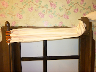 |
I think the curtain rails and holders really create the illusion of this set being a real house.
Monday, 23 May 2011
Psychological Horror Essay Research
I started by choosing the scenes from three films out of the five we reviewed which I personally think convey the theme of psychological terror the clearest. I chose to analyse these using the theory of the Uncanny. The scenes I have chosen show the directors using an ordinary object and putting it into a unrecognisable situation and therefore making it frightening. This will help me decipher why these images are so scary.

This is the still I am going to use to show how the film the Haunting uses an ordinary setting and situation but creates a frightening image.

The next scene I will be analysing is from the film the Shining. I will also be looking at what makes this image so frightening and effective.

The last film I will be analysing will be the scene of the bleeding fridge in the Machinist.
Bibliography
Freud, Anna. (1986) The Essentials of Psycho-Analysis. (1nd edition) London: Hogarth Press
Schneider , 2004, Horror Film and Psychoanalysis Freud’s Worst Nightmare. Usa: Cambridge University Press
Cavallaro, Dani, 2002, The Gothic Vision: Three Centuries of Horror, Terror and Fear. London: Continuum international Publishing
Spadoni, Robert, 2007, Uncanny Bodies: The coming of sound Film and the origins of the Horror Genre. USA: University of California Press
Wheeler, Winston, 2008, Short History of Film. USA: Rutgers University Press
Mould Studies
These studies show decay and the colours created by areas effected by mould. For both studies I used a range of inks, watercolour and pastels.

I think this study works particularly well through the sutall colours. The brown appears to be seeping through the paper, just like damp looks on walls. I am going to imitate this on the areas I want to add the mould. I am only going to do this in very slightly only to suggest damp and not make it too noticeable on first inspection.


I used a mixture of watercolours and charcoal to create this study of one of the windows. I incorporated the suggestion of mould through dark areas around the edges of the support frame and sides. This will highlight the room’s general tidy appearance but unnoticeable at first is the dust gather showing neglect from the family. This could be shown though the state of inside of the window glass should be dusty and grubby. This shows the extent of Gregor’s transformation has had on the family unit and has preoccupied them letting the house’s appearance to degrade.
I also thought how the light could be shinning through as our group had decided we would have some form of natural light in the living room as well as unnatural. I used yellow to show where the light would reflect of the window frame and surrounding room in to and within the room.
Research into Mould
Around the architrave and sill I wanted to create a suggestion of Gregor’s presence through elements such as damp and mould. I research into mould growing on walls and around the window area. I also took several photographs of mould inside a house. From this research I found several types of mould that show different patterning and colouring.

This mould shows a dotted pattern and shows the presence of damp on the wall.

These two photographs show how woodwork are effected by being exposed to wet and damp conditions. This causes the wood to crumble and creates an interesting pattern on the surface of the exposed area. I though this would be a good idea to imitate around the sill and bottom supporting section.


This gave me the idea of the ageing paint around the window frame.

Fig, 1 Room effected by flooding
Out off all the images I think this one is the most helpful and demonstrates the dirty surface created on the rest of the existing set walls already. I think the moterling effect the mould has created where the wall meets the ceiling shows how I might imitate mould creating this patterned effect. However I think what ever I do it must be sutal, as I don’t want the mould to overwhelm the image of the windows completely just suggest something’s not quite right.
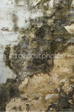
Fig 2, Mouldy Wall

Fig 3, Black Mould


Fig, 5
Both fig 4 and 5 show an extreme amount of physical decay to the inertia walls of the rooms. The exposed layers making up the wall combined with the pealing wallpaper creates a similar effect we were thinking of when creating Gregor’s room.

Finally I removed the news paper taped around the windows. I found a little amount of the paint had leaked onto the walls surrounding the edges of the windows. However this will not be visible once i have recreated mould around the effected areas.

The button polish picked up on all the tones of the layers we had combined together to create this colour.

To finish the painting off I used button polish, this highlighted certain sections of the wood creating a 3d dimensional effect to the panelling.

I think the chosen colours work well with the inertia and match well with the doors. However once a layer of button polish is added the wood’s colour will have a lot more depth to it.

For the next layers of paint we applied a mixture of different shades of brown to add an ageing and grainy effect to the surface of the frames. We achieved this by using a black wash, two different brown washes and a thicker and lighter brown wash. Then we went over the paint using a dry brush to remove parts of the top layers of paint. This would also revel the first black layer I put on the windows which will age the paint work.
To create the same effect and colour as the doors I started by applying Burnt umber. This added a woody colour to the frame and combined with a darker brown paint thinned using water. This continued the ageing paint look we wanted to create. I then went over the paint once it dry and sanded some of the layers back to reveal the black paint underneath.
Bibliography
Sunday, 22 May 2011
Window Construction

During the afternoon I applied the base coat onto the two windows. I planned to use the same colours that the doors had been painted with. This includes the first layer of blackwash, a mixture of watered down paint.

Next I covered the surrounding wallpaper that was touching the edges around the window. I used polyfiller to level the join between the mdf liner and the sill. I also filled any holes made by screws and sanded it down after.

I was finding it difficult to secure the sill into place using pins so I used 8 by 12 screws. These longer screws secured it to the wall and didn’t spilt the wood, which was happening when using pins.
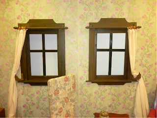
So far I think the style of the windows work well with the delicate patterned wallpaper. The layered mdf adds an extra depth to the architrave, making it fit better within the room. I repeated the shape of the top section on the support section under the sill.

Once I had added the top and two sidepieces onto both windows I decided to take out the screws and pin it to the wall instead. I did this because the screws would be much more noticeable once the windows were painting than pins.

The next stage was to screw the sidepieces of the architrave in place. I found matching the angles difficult. This may be a result of using the metric saw that isn’t as precise as the band saws.

Firstly I screwed the top piece onto the wall making sure the bottom of the piece lined up with the edge of the liner.
The next stage in making the windows was to make the architrave to go around the windows. For this I used my original design that features the top piece curved showing my inspiration from the decorative style Art Nuevo. I started by cutting the top section out of mdf. For the moulding I measured out another section to be applied on top of this piece. This extra piece will add more definition to the shape and add another dimension to the design. For this I used the band saw to cut the shape out, I then used the sanders to make the edges smooth and even. To attach the pieces together I used a glue gun, and then I pined it to make it more stable. For the side sections I need to cut four pieces of mdf measuring 5cm in thinness. For this I used a metric saw, I also used it for the angle cuts. For the sill I used a thicker veneered piece of wood which would measure 2 and half inches away from the edge of the architrave.

For the frames I cut two 2.8 ft. long pieces out of the 2 by 2 wood. For the bottom of the frame I cut two pieces of the 1 by 2 mil measuring, I decided to construct the frames separately as the individual pieces needed to be made fit exactly.

I am going to add pictures to create the illusion of inhabitants outside the set. I will put these images behind the persecutes which I will be adding after the beading.

To fully secure the frames I screwed small rectangles of mdf between the joins. I did this to all eight corners which strengthened the frames.

The next step was to assemble the frame to be routed before it could be put in the wall. First I had to attach the 1 by 2 pieces of wood together, because of the thickness of wood I have used for the vertical pieces. I did this for both the bottom and top pieces for the windows. I screwed the frame together using cordless drill, starting from one corner and working round clockwise, making it easier to maker the frame straight. I also used at setsquare to check they were right angles.

This drawing of the window from the outside imitates the expressive style I saw in my research of the art movement expressionism. I wanted to highlight the glass using yellow representing light. This colour has been used to suggest from the outside the appearance is average and normal creating an illusion conveying Gregor’s parent’s attitudes to wards their son’s situation.

This is another set design I did whilst doing the others. This room shows the interia and distressed look of the walls I imagined representing Gregor’s presence seeping through the cracks and doorways. Around the windows and doorframes I used a mixture of oil pastels, charcoal and chork to recreate the appearance of mould, reflecting my research the colours and pattern in the photographs captured.
Subscribe to:
Comments (Atom)